
Cognitive Load in Patient Communication: Patient Information Leaflets and Clinical Outcome Assessments Contrasted
Dec 17, 2025
UK
,
Spain
The challenge of information overload in medical communication
Modern medicine relies not only on prescribing the right treatment but also on ensuring patients and research participants understand the information given to them. Patient Information Leaflets (PILs) explain medications, side effects and precautions, while Clinical Outcome Assessments (COAs) and Patient-Reported Outcomes (PROs) capture patient experiences for research and regulatory purposes.
Yet both of these tools suffer from a common challenge: information overload. Overly long lists, dense formatting and technical jargon can overwhelm patients, compromise comprehension and even reduce adherence to treatment or survey reliability.
Cognitive psychology offers valuable insights into why this happens. We revisit Miller’s Magic Number 7 (±2) and the Google Effect to shed light on the limitations of human memory and the risks of information overload. Importantly, later research by Nelson Cowan suggested that Miller’s original 5–9 span was too generous. The real working memory limit is closer to 4 ± 1, which makes the design challenge sharper: the true human bandwidth is even narrower than most assume. When applied to medical communication, these insights suggest clear strategies for making PILs and COAs more effective, patient-friendly and reliable.
1. Miller’s Magic Number and the Problem of Overloaded Lists
Revisiting Miller’s Magic Number.
In 1956, psychologist George A Miller proposed that short-term memory can hold only about 5 to 9 items at a time. Cowan’s refinement to 4 ± 1 shows that our margin of tolerance was always thinner than Miller implied. This means that when patients face lists of 20+ side effects, they are not exceeding a 7–9 span, they are exceeding a span of just 3–5 items comfortably held in mind.
When patients face lists much longer than this limits, such as twenty or more possible side effects, they experience cognitive overload. Instead of processing the full set, they tend to remember only the first few or the last few. This is known as the primacy and recency effects.
Examples of overwhelming lists of side effects
A typical PIL may present side effects as one long sequence, as the following:
Possible side effects include: nausea, headache, dizziness, diarrhea, dry mouth, fatigue, constipation, insomnia, anxiety, muscle pain, joint pain, increased heart rate, blurred vision, stomach pain, drowsiness, rash, weight loss, hair loss, excessive sweating.
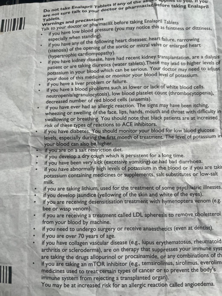
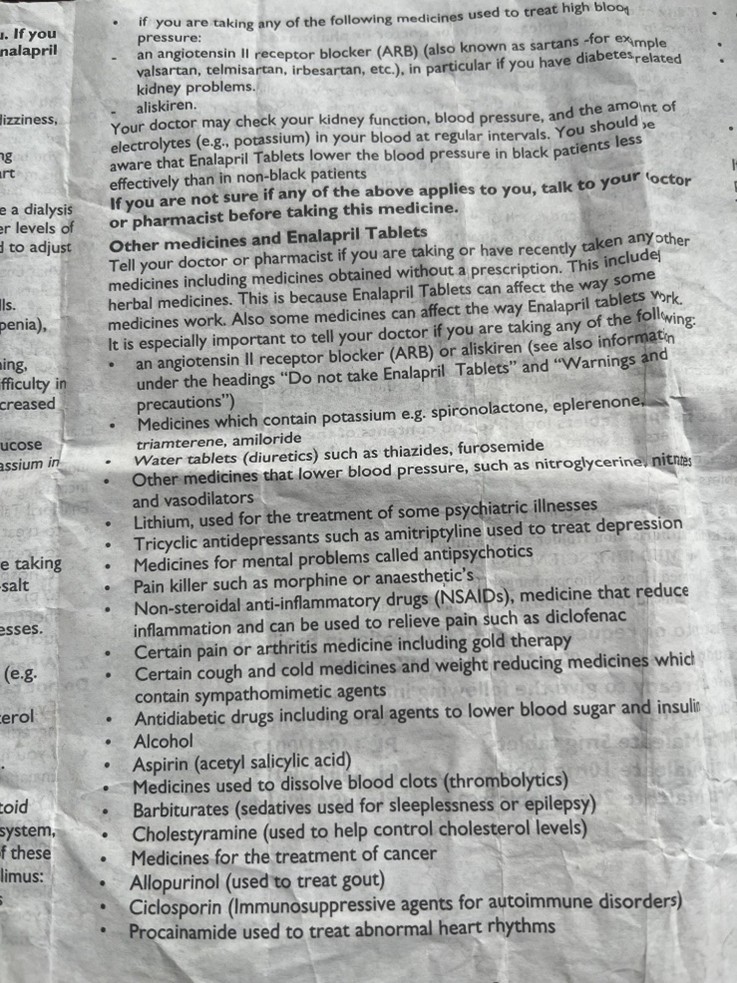
Or in a long list of bullet points, as in the following from an Enalapril leaflet:
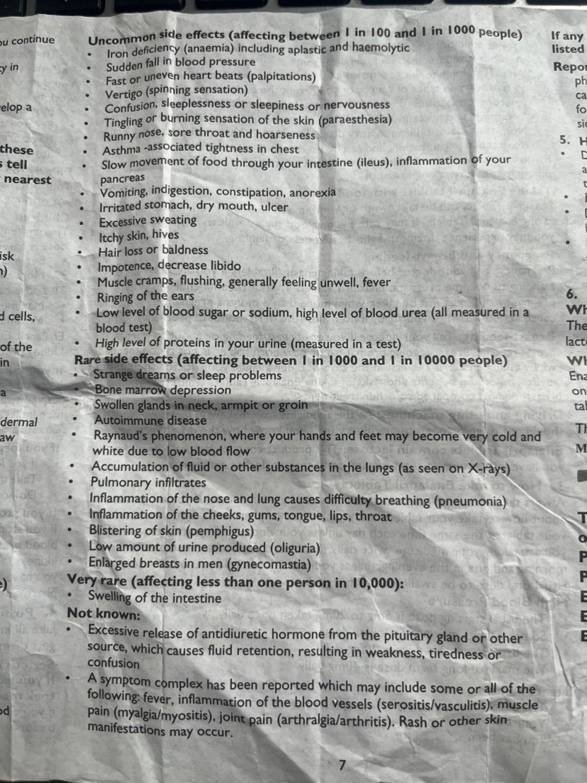
This leaflet also has extensive and unbroken lists of bullet points for the following:
Warnings and Precautions: 27 items in one single list of bullet points.
Other Medicines and Enalapril Tablets: 25 items in one single list of bullet points.
Serious side effects: 9 items in a single list of bullet points.
Uncommon side effects: 19 items in a single list of bullet points (the list above).
Rare side effect: 12 items in a single list of bullet points.
The proof:
The lists in both instances far exceed Miller’s limit. If we take Cowan’s 4 ± 1 as the more realistic ceiling, the overload is even more striking: patients may only hold 3–4 items in working memory while scanning such lists.
The likely outcome is that patients may remember “nausea, headache, dizziness” at the start of the first example and then “rash, weight loss, hair loss” at the end, ignoring the majority of information in the middle. Worse still is the real possibility that the intimidating presentation can provoke anxiety or even lead patients to discontinue treatment unnecessarily or simply not notice the side effect that is more relevant to them.
As a side note, all PILs in Europe and UK require user testing. One trick that some testing companies to get the leaflet to ‘pass’ the test is to employ when side effects are presented in this way is to choose a side effect from the first few or last few on list like these. Regulators would do well to get wise to this practice. If you consider the samples from the Enalapril leaflet, surely you must be wondering: who is designing these leaflets and who is testing them?
Best Practice: Chunking and Categorisation
Instead of overwhelming lists, information should be grouped into meaningful categories:
· Digestive issues: nausea, diarrhoea, dry mouth, constipation, stomach pain
· Neurological effects: headache, dizziness, insomnia, drowsiness.
· Muscle and joint issues: muscle pain and joint pain.
· Skin and hair changes: rash, sweating too much, hair loss.
· Other effects: anxiety, increased heart rate, blurred vision, weight loss.
This format allows the side effects to be “chunked”, enabling patients to process 5-7 categories rather than 18 scattered symptoms or 27 contraindications. The information becomes more digestible, less threatening and easier to recall.
Implications for COA Design
The same principle applies to survey design:
· Limit response options to 5 to 7 per question to avoid decision fatigue. In fact, with Cowan’s tighter span, even 5–7 may push patients; 3–5 clear options may align better with human limits.
· Break complex items into single concepts, such as instead of “fatigue and dizziness”, ask about each separately.
· Keep recall periods short so patients do not have to store too much in memory.
By aligning design with cognitive capacity, both PILs and COAs can reduce overload and improve accuracy.
Memory Offloading
We have written at length about the Google Effect, also known as digital amnesia, and how this has further eroded Miller’s Magic Number in what we can hold in our short-term memory. It refers to our tendency to forget information that we believe is easily retrievable online. In everyday life, this means we remember where to look something up, but not the content itself. Placed against Cowan’s 4 ± 1, the impact of digital amnesia is even starker. If working memory was only ever capable of holding a handful of items, reducing that to 2–3 with Google-style offloading leaves patients with almost no spare capacity when confronted with medical texts or COA instruments.
In medical communication, this has two major consequences:
· People may fail to internalise the details in leaflet because they assume they can always “just Google it later.”
· When they do Google, they may encounter false information, anecdotal horror stories or confirmation bias that amplifies anxiety.
Example: Googling Side Effects
A patient prescribed a new medication notices “anxiety” on the leaflet. Instead of trusting the PIL. Instead of trusting the PIL, they search for anxiety side effects in connection with a given drug. The first results are likely to be forum posts or sensational articles describing extreme, but rare, cases.
The results? Patients may conclude that the risk is higher than it truly is and stop taking the medication, jeopardising adherence and treatment outcomes.
Cognitive Overload and Readability in Patient-Facing Documents
Even beyond lists, PILs often suffer from broader readability problems:
· Dense text blocks that are difficult to scan.
· Medical jargon such as “hepatic impairment” or “contraindicated” that patients may not understand.
· Excessive warning that can increase fear rather than promote safe use.
How can this be fixed? The obvious answer is improving the accessibility of the language use, where “hepatic impairment” would be “liver damage” or creating a more usable visual style. Regulations and best practice guidance are often orbit around the physical paper version of the leaflet. This is, of course, the traditional method of PIL delivery: it comes tightly folded in a box that you need to unfold and, ideally, read, as in the documents that we included here. However, electronic delivery of patient information offers providers of information greater scope to reach out to patients. The fact that few of them do points to a lack of appetite for the Patient Voice. A package leaflet is an opportunity to communicate directly to patients.
Nonetheless, some of the way to improve communication about medicines could be to:
· Adopt a Q&A format, where real patient questions make the text feel more personal and practical:
Q: What should I do if I feel dizzy after taking this medication?
A: Sit down until it passes. If it continues for more than a few days, tell your doctor, nurse or pharmacist.
· Enhance visual accessibility: Break information into bullet points, add white space and bold critical warnings.
· Use progressive disclosure in digital leaflets: allow patients to expand sections only when relevant to them, reducing visual clutter.
Best Practices for Clinical Outcome Assessments (COAs)
COAs face a different but related challenge: survey fatigue. Long or complex instruments reduce response accuracy and can even lead to dropout.
To reduce cognitive burden, developers should:
· Limit items per page so that participants are not overwhelmed.
· Use consistent scales to minimise confusion.
· Keep recall periods short, i.e. “in the last 24 hours”, rather than “in the past 3 months”.
· Test digital usability so respondents can easily navigate on phones or tablets.
Ultimately, COAs should respect the same cognitive constraints as PILs: limit memory load, simplify tasks and avoid unnecessary complexity.
Regulatory Considerations
Both FDA and EMA emphasise patient-friendly communication. Their guidance encourages:
· Categorisation of side effects by frequency.
· Use of plan language instead of technical jargon.
· Presentation of information in accessible, structured formats.
For COAs, regulatory authorities increasingly scrutinise whether instruments are both valid and patient-centred. Surveys that impose excessive cognitive burden may undermine data quality and regulatory acceptability (but, then, leaflets like those cited above still manage to get through the regulatory process).
Designing for the Human Mind
Medical communication must bridge the gaps between scientific accuracy and human cognitive limitations. Bother Miller’s Magic Number and the Google Effect remind us that patients and research participants are not passive data receivers but active processors with limited memory and a tendency to offload information. And Cowan’s work reminds us that this limit is narrower than Miller’s myth: 4 ± 1 items rather than 7 ± 2. Designing PILs and COAs with this tighter constraint in mind is essential if we want materials that are usable in practice, not just in principle.
For Patient Information Leaflets, this means:
· Chunking side effects into meaningful groups.
· Adding probability categories to contextualise risks.
· Using plain language and clear visual design.
· Exploit further affordances offered by electronic format to enhance accessibility and patient reach.
For Clinical Outcome Assessments, this means:
· Limiting options and items to avoid cognitive fatigue.
· Keeping recall periods short.
· Embedding clarity and usability into digital tools.
By applying these cognitive psychology principles, medical communication becomes not just a regulatory requirement but a genuine tool for improving patient understanding, adherence and trust, as well as ensuring that clinical research data is both reliable and meaningful.
Thank you for reading,
Mark Gibson, Leeds, United Kingdom
Nur Ferrante Morales, Ávila, Spain
August 2025
Originally written in
English